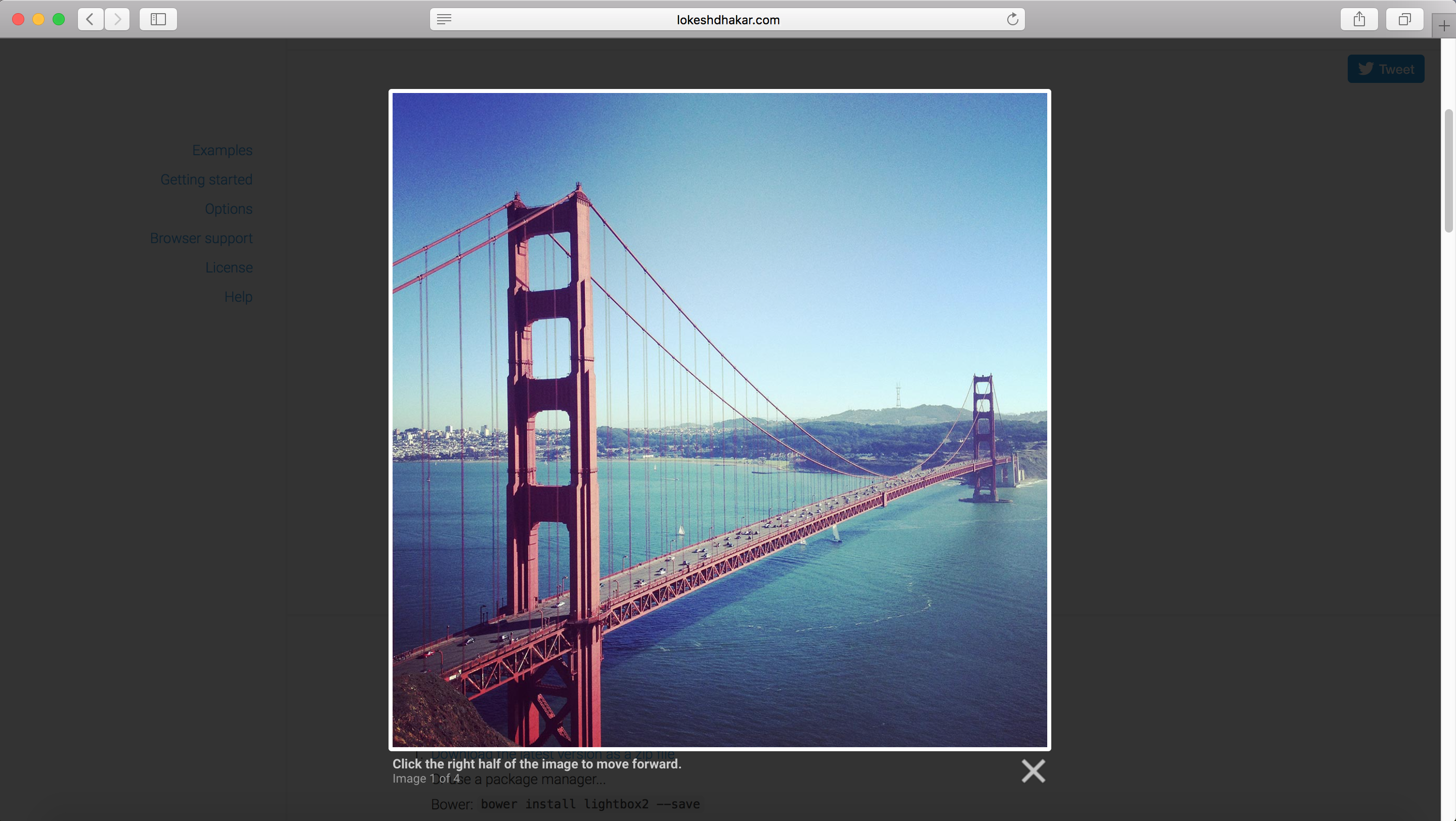
You may say that Modal windows are what pop up were 10 years ago. Like them or hate them they have become an essential UI design element for almost any website or application. Recently I have started to see a transition of how these screens are being used. We first started seeing modals about 8 years ago when a developer named Lokesh Dhakar created a Javascript Library called “Light Box”. It was a very simple way of putting focus on one image at a time and graying out everything else.
This became so popular that many people starting to throw anything and everything in these smaller focused screens. Some people call them Dialog boxes, others call them Modals but they really all mean the same thing. The main purpose is to present the user with additional information while putting the main parent page on hold until they are done.
Of course with any UI design element they have been misused and abused in many different ways. I have seen some applications that have more than 3 levels of modals one on top of each other. Or times where the modal includes an extremely complex workflow or wizard that does not allow the user to exit until a set of criteria is fulfilled. Most of the times when modals are used in the wrong way it is because the content owners are trying to inject way to much information in such a small space. Rule of thumb, if you have to consider either a “Next” button or a “Scrollbar” in your design just STOP. It may be better to have a new full page dedicated to that content and not a modal.
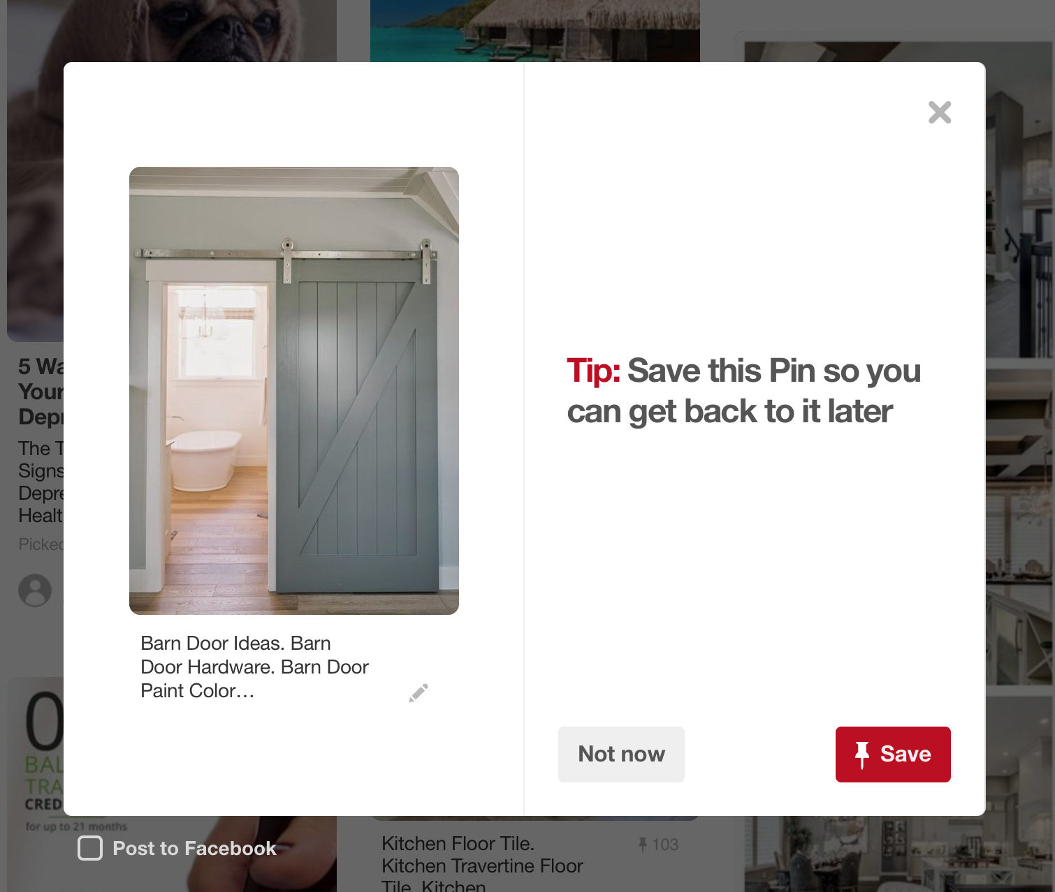
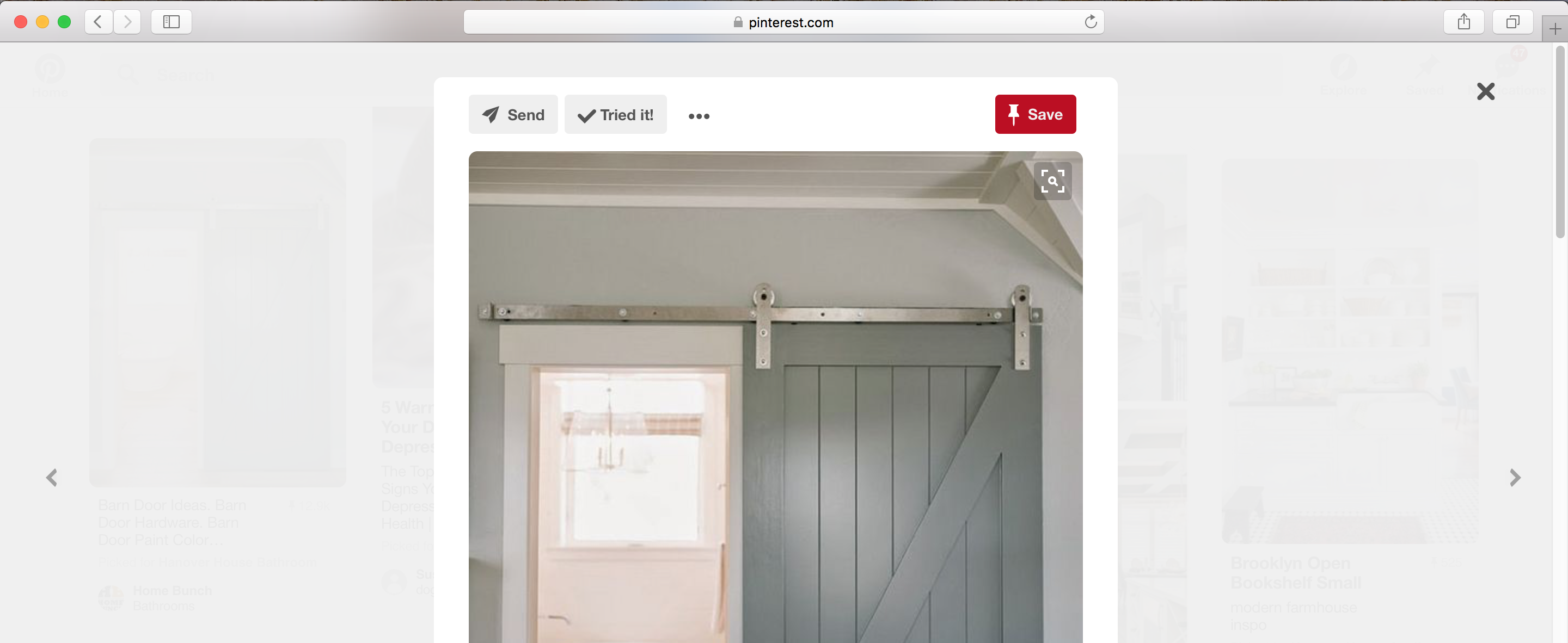
With the introduction of bootstrap and other frameworks modals have become pretty standard on how users will interact with them. Usually the grayed out area is a clickable area that allows users to navigate back to the parent screen. Other times we become overly cautious and have “X” icons and “Cancel” buttons to make sure users feel comfortable that they are not stuck on an overlay page and no way to get back. One interesting trend I am seeing lately is moving the “X” button outside of the modal box and into the gray area. Pinterest uses both on their website which to me is a little bit confusing...
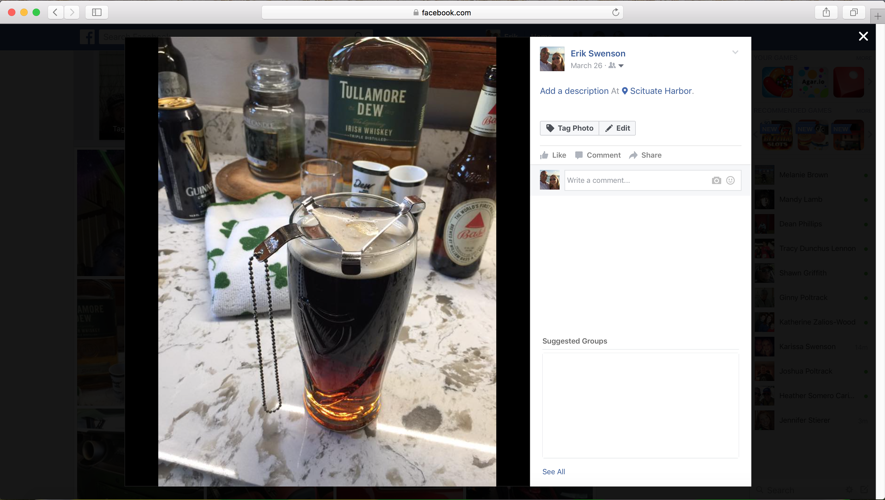
If you look at Facebook the close icon is all the way to the top right. This is slightly annoying for the users since they have to move their cursor a pretty far distance on larger screens to close it down. However since the whole gray area is clickable it is not a deal breaker. I would be interested to see some metrics on how often in Facebook users actually click the “X” icon vs clicking on the gray background?
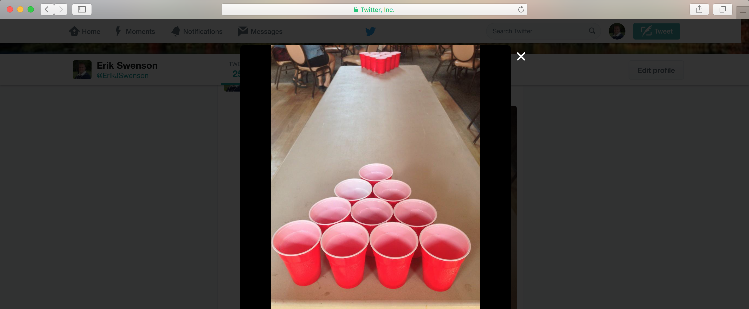
Twitter has the close icon closer to the box which makes it slightly easier for the users to close it down.
Overall the biggest thing to remember is that modals are meant as short term screens to present and capture small bits of additional information that supports the parent screen. They should not be used for presenting heavy content, complex workflows and modals on top of modals. One last thing to consider is that you will need to consider alternative ways of presenting these screens on mobile devices. In most cases they will become full screen take overs due to the limited space available.